GarnerTech designed and developed the logo and website, helped C.H.Bradford with domain hosting setup and social media advice. We believe, it’s got a lovely clean look, with splashes of color from the logo design. Check it out.
]]>
The logo represents a spanner and a mouse to show we provide a service to maintain websites.
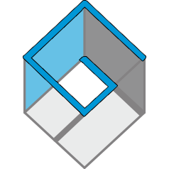
]]>To the untrained eye, it may look like a funky, abstract, 3D cube, but the clues are there if you know what you’re looking for.
Nested on two different planes within the logo are the company initials, G and T, highlighted in the images below in blue.

So there you have it! Testament to the genius of Lisa!
Want a cool logo like this with Lisa working on your company’s brand?
]]>